
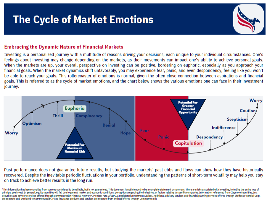
March 2024: Investing is a personalized journey with a multitude of reasons driving your decisions, each unique to your individual circumstances. One's feelings about investing may change depending on the markets, as their movements can impact one's ability to achieve personal goals. When the markets are up, your overall perspective on investing can be positive, bordering on euphoric, especially as you approach your financial goals. When the market dynamics shift unfavorably, you may experience fear, panic, and even despondency, feeling like you won't be able to reach your goals. This rollercoaster of emotions is normal, given the often close connection between aspirations and financial goals. This is referred to as the cycle of market emotions, and the chart above shows the various emotions one can face in their investment journey.
*This information has been compiled from sources considered to be reliable, but is not guaranteed. This document is not intended to be a complete statement or summary. There are risks associated with investing, including the entire loss of principal you invest. In general, equity securities will fall due to general market and economic conditions, perceptions regarding the industries, or factors relating to specific companies. Information references from Claymore Securities, Inc. Securities and advisory services offered through Commonwealth Financial Network®, Member FINRA/SIPC, a Registered Investment Adviser. Fixed insurance products and services are separate from and not offered through Commonwealth.

March 2024: This chart illustrates the performance of the investment markets from 2003 to 2022. Take notice of the contrast between the typical investor's experience and the performance of various market sectors. For many investors, making hasty decisions during market downturns often leads to lower returns compared to the broader market. It shows us that despite market ups and downs, staying committed to your investments over the long term can result in positive outcomes.
Source: Bloomberg, June 30, 2023. Average asset allocation investor return is based on an analysis by DALBAR, Inc., which utilizes the net of aggregate mutual fund sales, redemptions and exchanges each month as a measure of investor behavior. Indices shown are as follows: REITs are represented by the NAREIT Equity REIT Index, U.S. Stocks are represented by the S&P 500 Index, International Equities are represented by the MS CI EAFE Index, Government-Related Bonds are represented by the Bloomberg Global Aggregate TR Index, Homes are represented by U.S. existing home sales median price, Inflation is represented by Consumer Price Index. Indices are unmanaged and cannot be purchased directly by investors. Index performance is shown for illustrative purposes only and does not predict or depict the performance of any investment. Past performance is no guarantee of future results. Investors cannot invest directly in an index, and unmanaged index returns do not reflect any fees, expenses or sales charges.

March 2024: This chart delves into the relationship between major global events and the performance of the S&P 500, one of the most widely followed stock market indices. It covers significant events that have occurred annually since 1999, including the 2003 Iraq War, the 2008 global financial crisis, and the 2020 COVID-19 pandemic, among others.
Each year, investors are often rattled by various events, fearing that these events could have a detrimental impact on the stock market. However, this chart aims to provide perspective on how the S&P 500 has fared during these turbulent times. It tracks two key metrics: the maximum drawdown percentage, which measures the peak-to-trough decline in the S&P 500 during each event, and the cumulative S&P 500 price return percentage, which reflects the overall performance of the index over the same period.
In simpler terms, the chart illustrates that while significant events may trigger panic among investors, causing temporary declines in the stock market (as indicated by the maximum drawdown percentage), the S&P 500 has historically demonstrated resilience and the ability to recover over time. Despite facing numerous challenges, including economic downturns and geopolitical tensions, the cumulative price return of the S&P 500 has continued to trend upwards over the years.
Ultimately, this chart serves as a reminder that while market volatility and uncertainty are inevitable, a long-term perspective and staying invested through turbulent times have historically been rewarded by the resilience and growth of the stock market.
*Cumulative S&P 500 price return is calculated from day prior to the new year (ex. 1999 looks at 12/31/1998) to present. Data as of Dec. 31, 2023. Sources: Bloomberg, Federal Reserve, S&P. Past performance is not a guarantee of future results. Investors cannot invest directly in an index, and unmanaged index returns do not reflect any fees, expenses, or sales charges.

March 2024: This chart aims to debunk the misconception that investing in the stock market is akin to gambling in a casino. It compares the odds of winning at various casino games, such as roulette, blackjack, and slot machines, with the likelihood of making money in the stock market.
The chart illustrates that the odds of winning at casino games are often stacked against the player, with most games having a low probability of success. On the other hand, it shows the percentage of time that the US stock market has posted positive returns over rolling periods spanning from 1901 to 2023.
By juxtaposing these two sets of data, the chart highlights the fundamentally different nature of investing in stocks versus gambling in a casino. While casino games are designed for the house to win in the long run, investing in stocks historically has offered investors higher probability of positive returns over time, despite occasional market fluctuations.
In essence, the chart serves as a visual reminder that investing in the stock market is not a game of chance link gambling, but rather a strategic approach to wealth accumulation over the long term.
Source: Bloomberg L.P., 12/31/23. Chart is for illustrative purposes only and is not intended as investment advice. US Stocks are represented by the Dow Jones Industrial Average Index. Source of Casino odds: Wizard of Odds. The charts are hypothetical examples which ar shown for illustrative purposes only and do not predict or depict the performance of any investment. Indexes cannot be purchased directly by investors. See appendix for index definitions. Past performance does not guarantee future results.

March 2024: This chart illustrates the critical difference between "time in the market" and "timing in the market" by highlighting the impact of missing out on the best-performing days of the stock market over the long term.
Imagine you're investing in the stock market and aiming to maximize your returns. The chart shows that staying invested in the market consistently over time, known as "time in the market" is more beneficial than trying to predict and time the market's movements.
The dotted line on the chart represents the growth of a hypothetical initial investment of $100K. It demonstrates that even if the market experiences ups and downs, staying invested throughout - without trying to jump in and out based on market fluctuations - can lead to significant growth in your investment portfolios over time.
The chart emphasizes the importance of staying invested in the market for the long term, rather than attempting to predict short-term market movements. By remaining invested through market fluctuations and avoiding the temptation to time the market, investors can benefit from the potential growth opportunities offered by the stock market over time.
Additional food for thought: the best performing days in the market often occur within two weeks of the worst performing days for that same year, making "time in the market" a virtually impossible task.
Sources: BlackRock; Bloomberg. Stocks are represented by the S&P 500 index, an unmanaged index that is generally considered representative of the U.S. stock market. Past performance is no guarantee of future results. It is not possible to invest directly in an index.

January 2026: This chart displays U.S. stock market performance for each president, from Nixon through Biden. The chart displays the annualized stock market return during each presidents time in office, along with how many recessions occurred while they were president. The data allows you to see how markets performed across different administrations and economic environments.
In simple terms, the stock market has historically produced positive returns under presidents from both political parties. The key takeaway is that markets tend to reward long-term investors over time, and economic cycles play a much larger role in market performance than which party holds the presidency.
Note: 0* represents situations where a recession was already underway when the President took office and ended within three quarters.
Sources: FactSet, NBER, S&P. Investors cannot invest directly in an index, and unmanaged index returns do not reflect any fees, expenses, or sales charges. Past performance is not a guarantee of future results.

March 2024: This chart sheds light on a common misconception in investing: the belief that one can accurately predict the best and worst days in the market. It emphasizes the significant impact of missing out on just a few of the best days in the market over the past 30 years, from 1993 to 2023. Many of these best days often occur during times of market volatility, when emotions like fear and uncertainty are at their peak.
The chart shows that trying to time the market perfectly, like predicting when to buy and sell stocks, is nearly impossible. It highlights how missing even just the top 10 best days in the market can substantially reduce investment returns over the long term. It's akin to trying to guess the winning lottery numbers; even missing one or two can significantly impact your chances of winning big. Instead, the chart underscores the importance of staying invested throughout market ups and downs, as history has shown that missing out on key days can hurt investment performance.
Source: Bloomberg L.P., 1/1/93 - 12/31/23. For illustrative purposes only and is not intended as investment advice. The charts are hypothetical examples which ar shown for illustrative purposes only and do not predict or depict the performance of any investment. Indexes cannot be purchased directly by investors. See appendix for index definitions. Past performance does not guarantee future results.

March 2024: When the stock market experiences significant drops, it's natural to feel the urge to sell your investments and move to cash for safety. This reaction is often driven by the fear of losing money, which can be stronger than the satisfaction of making gains. However, this decision can have serious consequences. During times of market volatility, the best days often follow closely after the worst days.
This chart shows the difference between an investor who stayed fully invested in the S&P 500 for the past 20 years and those who missed out on some of the best days by being out of the market at various times. Missing just the top 10 best days reduced the average yearly return by nearly 50%. And if an investor missed the top 40 days, they would have experienced a negative return on their original investment of $10,000.
The key takeaway is that sticking with a diversified, long-term investment strategy could lead to better retirement outcomes. It's essential to resist the urge to react emotionally to market fluctuations and instead focus on maintaining a disciplined approach to investing over time.
Source: J.P. Morgan Asset Management analysis using data from Bloomberg. Returns are based on the S&P 500 Total Return Index, an unmanaged, capitalization-weighted index that measures the performance of 500 large capitalization domestic stocks representing all major industries. Indices do not include fees or operating expenses and are not available for actual investment. The hypothetical performance calculations are shown for illustrative purposes only and are not meant to be representative of actual results while investing over the time periods shown. The hypothetical performance calculations are shown gross of fees. If fees were included, returns would be lower. Hypothetical performance returns reflect the reinvestment of all dividends. The hypothetical performance results have certain inherent limitations. Unlike an actual performance record, they do not reflect actual trading, liquidity constraints, fees and other costs. Also, since the trades have not actually been executed, the results may have under - or overcompensated for the impact of certain market factors such as lack of liquidity. Simulated trading programs in general are also subject to the fact that they are designed with the benefit of hindsight. Returns will fluctuate an investment upon redemption may be worth more or less than its original value. Past performance is not indicative of future returns. An individual cannot invest directly in an index. Data as of December 31, 2023.
 March 2024: This chart shows the yearly returns of various types of investments over a 15-year period. It includes stocks, bonds, commodities, real estate, and cash. On the left side of the chart, you can find both the average yearly return and the average yearly volatility for each investment type over the past 15 years. The white boxes represent a hypothetical diversified portfolio which illustrates from year to year the importance of spreading your assets across different areas of the investment market. Take notice that no one area of the market is the best or the worst performer year after year. Allocating your investments in a diversified manner is key to maintaining exposure to different areas of the market while helping to reduce the market volatility you experience in your portfolio. It can often be the difference between riding the roller coaster ride of the markets, versus experiencing a smoother ride toward achieving your long-term investment objectives.
Source: Bloomberg, Factset, MSCI, NAREIT, Russell, Standard & Poor's, J.P. Morgan Asset Management.
Large cap: S&P 500, Small cap: Russell 2000, EM Equity: MSCI EME, DM Equity: MSCI EAFE, Comdty: Bloomberg Commodity Index, High Yield: Bloomberg Global HY Index, Fixed Income: Bloomberg US Aggregate, REITs: NAREIT Equity REIT Index, Cash: Bloomberg 1-3m Treasury. The "Asset Allocation" portfolio assumes the following weights: 25% in the S&P 500, 10% in the Russell 2000, 15% in the MSCI EAFE, 5% in the MSCI EME, 25% in the Bloomberg US Aggregate, 5% in the Bloomberg 1-3m Treasury, 5% in the Bloomberg Global High Yield Index, 5% in the Bloomberg Commodity Index and 5% in the NAREIT Equity REIT Index. Balanced portfolio assumes annual rebalancing. Annualized (Ann.) return and volatility (Vol.) represents period from 12/31/2009 to 12/31/2023. Please see disclosure page at end for index definitions. All data represents total return for stated period. The "Asset Allocation" portfolio is for illustrative purposes only. Past performance is not indicative of future returns.
Guide to the markets - U.S. Data are as of January 31, 2024.

March 2024: This chart displays how investment managers have performed over the past 20 years across different types of assets. It shows the difference between the best and worst-performing managers in each asset category and how much more the top-performing managers have earned compared to the bottom ones. Additionally, it illustrates how a $1,000 investment made 20 years ago would have grown if invested with the best and worst-performing managers.
The point being that what you invest in, is only part of the equation. The investment managers and strategies you choose can also have an impact on your long-term investment returns.
Source: Morningstar, J.P. Morgan Asset Management.
*Represents average annual portfolio return dispersion between the 10th and 90th percentile over a 20-year period for each Morningstar Category, including mutual funds and ETFs. Returns are updated monthly and reflect data through 11/30/2023. This information is for illustrative purposes only, does not reflect actual investment results, is not a guarantee of future results and is not a recommendation.
Guide to the markets - U.S. Data are as of December 31, 2023.
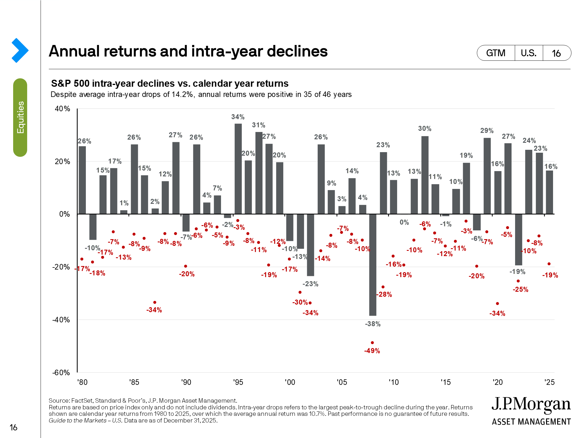
March 2024: This chart displays dips in the stock market within a single year, represented by the red dots and corresponding intra-year return, alongside the market's overall return for the entire year, represented by the gray bars. It's evident from this chart that despite these temporary declines, the market often rebounds and ends the year with positive gains. This serves as a reminder for investors to remain steadfast during turbulent market periods.
Source: FactSet, Standard & Poor's, J.P. Morgan Asset Management.
Returns are based on price index only and do not include dividends. Intra-year drops refers to the largest market drops from a peak to a trough during the year. For illustrative purposes only. Returns shown are calendar year returns from 1980 to 2023, over which time period the average annual return was 9.0%
Guide to the markets - U.S. Data are as of January 31, 2024.
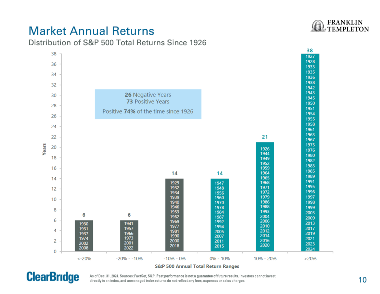
March 2024: This chart provides insights into the historical performance of the S&P 500, a key benchmark for the U.S. stock market, by showcasing the distribution of its total returns since 1926. Total returns include both price appreciation an dividends reinvested. Since 1926, there have been 26 years with negative returns and 72 years with positive returns, indicating that the market has been positively approximately 73% of the time over this period. This highlights the long-term growth potential of investing in the stock market.
A key takeaway is the historical trend of the stock market's resilience and ability to generate positive returns over time, despite occasional downturns. It emphasizes the importance of adopting a long-term investment approach and staying invested through market fluctuations to capture the benefits of equity market growth.
As of Dec. 31, 2023. Sources: FactSet, S&P. Past performance is not a guarantee of future results. Investors cannot invest directly in an index, and unmanaged index returns do not reflect any fees, expenses or sales charges.

Fall 2023: As interest rates near an anticipated peak, we wanted to provide a snapshot of how the fixed-income and stock markets have historically performed in the year following interest rate plateaus.
The chart above illustrates that the fixed-income and stock markets react favorably. While history is no guarantee of future performance, this is one of the many tools we use to manage your portfolio.
While high-interest rates may pose challenges for borrowing in areas like real estate and vehicle purchases, there is a silver lining: They create unique investment opportunities in the investment markets.
Source: Bloomberg, FactSet, Federal Reserve, Robert Shiller, J.P. Asset Management.
The 60/40 portfolio is 60% invested in S&P 500 Total Return Index and 40% invested in Bloomberg U.S. Aggregate Total Return Index. The S&P 500 total return figure from the 1984 period was calculated using data from Robert Shiller. The analysis references the month in which the month-end 6-month CD rate peaked during previous rate hiking cycles. CD rate data prior to 2013 are sourced from the Federal Reserve, whereas data from 2013 to 2023 are sourced from Bloomberg. CD subsequent 12-month return calculation assumes reinvestment at the prevailing 6-month rate when the initial CD matures.
J.P. Morgan Guide to the Markets - U.S. Data are as of December 31, 2023.
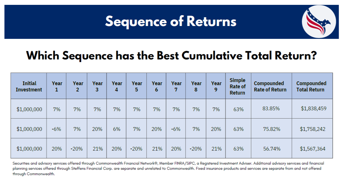
March 2024: During the accumulation phase, the sequence of returns plays a significant role in the long-term accumulation of investment and retirement assets by taking advantage of compounding returns. The impact of the return sequence during the accumulation phase differs from that of the distribution phase; however, it should be considered when making long-term investment decisions.
Impact on savings growth: The sequence of returns can affect how quickly your savings grow over time. Reducing volatility and achieving more consistent investment returns during the accumulation phase allows the compounding effect to enhance your portfolio’s value compared to a more volatile return sequence that includes more significant gains and more considerable periodic losses. Conversely, poor returns early on may slow down the growth of your savings.
Risk tolerance and investment strategy: The sequence of returns can influence your risk tolerance and investment strategy during the accumulation phase. Suppose you experience volatile or negative returns early in your investment journey. In that case, you might overreact to the volatility and make decisions regarding your investment strategy that don’t align with your long-term investment objectives.
Long-term goals and planning: The sequence of returns can influence your long-term financial goals and planning during the accumulation phase. If you experience favorable returns early on, you may be able to reach your savings targets more quickly. Conversely, if you face challenges like market downturns, you may need to adjust your savings rate or extend your investment horizon to achieve your goals.
Overall, while the impact of the sequence of returns during the accumulation phase may not be as pronounced as during the distribution retirement phase, it still plays a crucial role in shaping your investment journey and long-term financial outcomes. Diversification, regular contributions, and maintaining a long-term perspective are essential strategies to navigate the challenges posed by varying sequences of returns during the accumulation phase.
Securities and advisory services offered through Commonwealth Financial Network®, Member FINRA/SIPC, a Registered Investment Adviser. Fixed insurance products and services offered by Steffens and Steffens LLC.
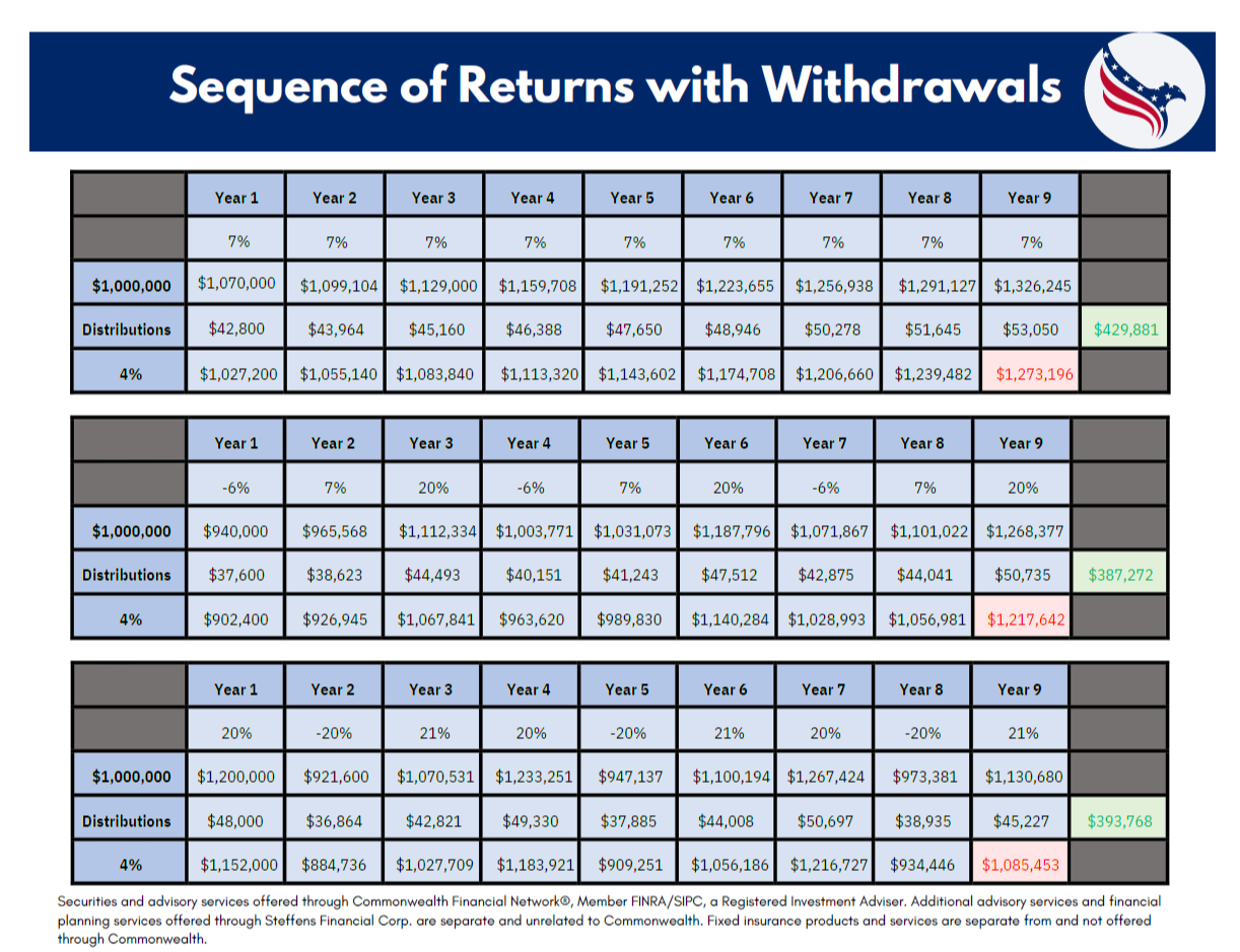
March 2024: The sequence of returns refers to the order in which investment returns occur over a period of time. It’s a crucial concept in financial planning, especially for retirees or those nearing retirement. In a nutshell, the sequence of returns can significantly impact the overall investment performance, particularly in the context of drawing down retirement savings.
Here’s why:
Timing of withdrawals: Individuals typically withdraw funds from their investment portfolio to cover living expenses during retirement. If they experience poor investment returns early in retirement, they might have to withdraw more principal to meet their expenses, leaving less capital to benefit from potential market recoveries later on.
Impact on portfolio value: Poor returns early in retirement can disproportionately impact the portfolio’s overall value, especially if withdrawals are being made concurrently. Even if the market rebounds later, the portfolio might not fully recover due to the reduced capital base.
Longevity risk: If withdrawals are high or returns are consistently poor, there’s a risk of exhausting retirement savings prematurely, potentially leaving retirees without sufficient funds to maintain their desired lifestyle in later years.
Strategies such as asset allocation, diversification, and incorporating guaranteed income streams (like annuities) can help mitigate the impact of adverse sequence of returns risk. Additionally, having a contingency plan or flexible spending approach can provide retirees with more resilience against market volatility and unfavorable sequences of returns.
Securities and advisory services offered through Commonwealth Financial Network®, Member FINRA/SIPC, a Registered Investment Adviser. Fixed insurance products and services are separate from and not offered through Commonwealth.

March 2024: Many Americans don't fully grasp the advantages and drawbacks associated with the age at which they claim their Social Security benefits. The chart shows the trade-offs of collecting early, at Full Retirement Age (FRA), or deferring until age 70. While collecting early will cost you as much as 30%, waiting until age 70 for benefits can add as much as an additional 32% of your benefits versus collecting at Full Retirement Age.
Claiming benefits early means a permanent reduction in payout and something that should be considered with your cash flow needs throughout retirement, along with your expected longevity. Claiming early at 62 would only provide 70-75% of the benefit a person is entitled to at their full retirement age. Over time, cost-of-living adjustments (COLA) further widen the gap. The average annual COLA over the past 38 years has been 2.8%.
For illustrative purposes only. The Social Security Amendments Act of 1983 increased FRA from 65 to 67 over 40 years. The first transition phase increased FRA from 65 to 66 for individuals turning 62 between 2000 and 2005. After an 11-year hiatus, the transition from 66 to 67 (2017-2022) is complete. This material should be regarded as educational information on Social Security and is not intended to provide specific advice. If you have questions regarding your particular situation, you should contact the Social Security Administration and/or your legal or tax professional.
Source: Social Security Administration, J.P. Morgan Asset Management.

March 2024: The age you choose to start receiving Social Security payments impacts how much you'll receive. Typical claiming ages are 62, Full Retirement Age (67 for those born in 1960 or later), and 70. The bar charts illustrate the typical ages at which people start claiming benefits and the total monthly benefits they'd get at those ages, assuming they earned the maximum income for 35 years.
Waiting until age 70 to claim offers the highest payout, but it means waiting eight years to start receiving benefits. The shaded area between the bars shows that waiting to claim results in higher cumulative benefits compared to claiming earlier. This is known as the "breakeven age". For example, the breakeven age between claiming at 62 and Full Retirement Age is 77, and between Full Retirement Age and 70 is 81.
At the bottom of the page, percentages indicate the average likelihood that someone currently aged 62 will live to a certain age or beyond. Comparing these percentages to the breakeven ages helps individuals decide when to claim Social Security benefits. However, other factors should be considered, such as your cash flow needs now and through retirement. Maximizing the dollars you receive from social security may not line up with your cash flow needs prior to age 70. The same holds true for collecting as early as 62. If you don't need the additional cash flow, it may be to your advantage to wait to collect.
Couple assumes at least one lives to the specified age or beyond. Breakeven assumes the same individual, born in 1962, earns the maximum wage base each year ($168,600 in 2024), retires at the end of age 61, and claims at 62 & 1 month, 67 and 70, respectively. Benefits are assumed to increase yearly based on the Social Security Administration 2023 OASDI Trustee’s Report intermediate estimates (annual benefit increase of 2.4% in 2025 and thereafter). Monthly amounts with the cost-of-living adjustments (not shown on the chart) are $4,311 at FRA and $5,739 at age 70. The exact breakeven ages are 76 years & 10 months and 80 years & 8 months.
Source: Social Security Administration, J.P. Morgan Asset Management.
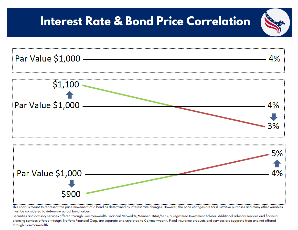
March 2024: Coupon Rate vs. Market Rate: Bonds typically have a fixed coupon rate, which is the interest payment made to bondholders. When interest rates in the market rise above the bond’s coupon rate, newly issued bonds start offering higher yields. This makes existing bonds with lower coupon rates less attractive, causing their prices to fall to adjust for the lower yield.
Yield and Price: Bond prices and yields (interest rates) have an inverse mathematical relationship. When bond prices fall, yields rise, and vice versa. This is because the coupon payment remains fixed, so if the bond is priced lower, the coupon payment as a percentage of the new lower price increases, thus increasing the yield.
Market Demand: Higher interest rates also make newer bonds more appealing to investors because they offer better returns. Consequently, demand for existing bonds with lower yields decreases, causing their prices to fall as investors seek higher-yielding alternatives.
Here’s an example of what an investor might experience regarding interest rates and bond values:
Imagine you bought a bond for $1,000 that pays you $50 in interest every year. That $50 is your fixed annual income from the bond, also known as the coupon payment. Now, let’s say that shortly after you buy this bond, interest rates in the market start to rise.
When interest rates go up, new bonds issued in the market offer higher interest rates. Instead of $50, new bonds might offer $60 annually. Investors notice this and prefer the newer bonds because they provide more income for the same investment amount.
Now, if you decide to sell your bond that pays $50 per year, potential buyers will look at it differently. They know they could get $60 per year from a new bond, so they won’t be willing to pay you the full $1,000 you initially paid. They might offer you less, maybe $950, to make up for the lower income compared to the new bonds offering $60.
This decrease in the price of your bond is what we mean by the inverse relationship between interest rates and bond values. As interest rates go up, the value of existing bonds with lower coupon payments tends to decrease because they become less attractive compared to newly issued bonds with higher coupon payments.
This chart is meant to represent the price movement of a bond as determined by interest rate changes. However, the price changes are for illustrative purposes and many other variables must be considered to determine actual bond values. Securities and advisory services offered through Commonwealth Financial Network®, Member FINRA/SIPC, a Registered Investment Adviser. Fixed insurance products and services are separate from and not offered through Commonwealth.


